Key decisions
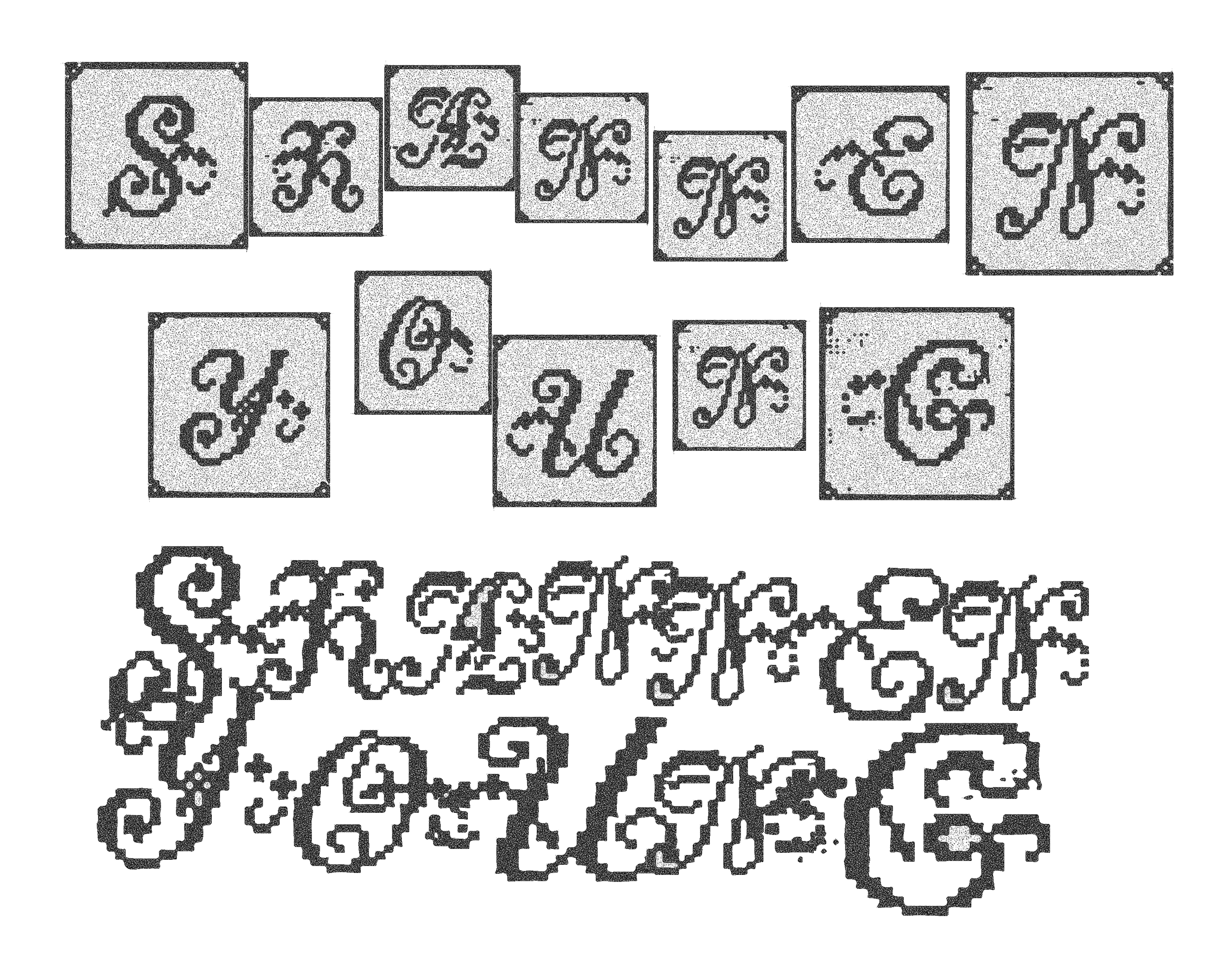
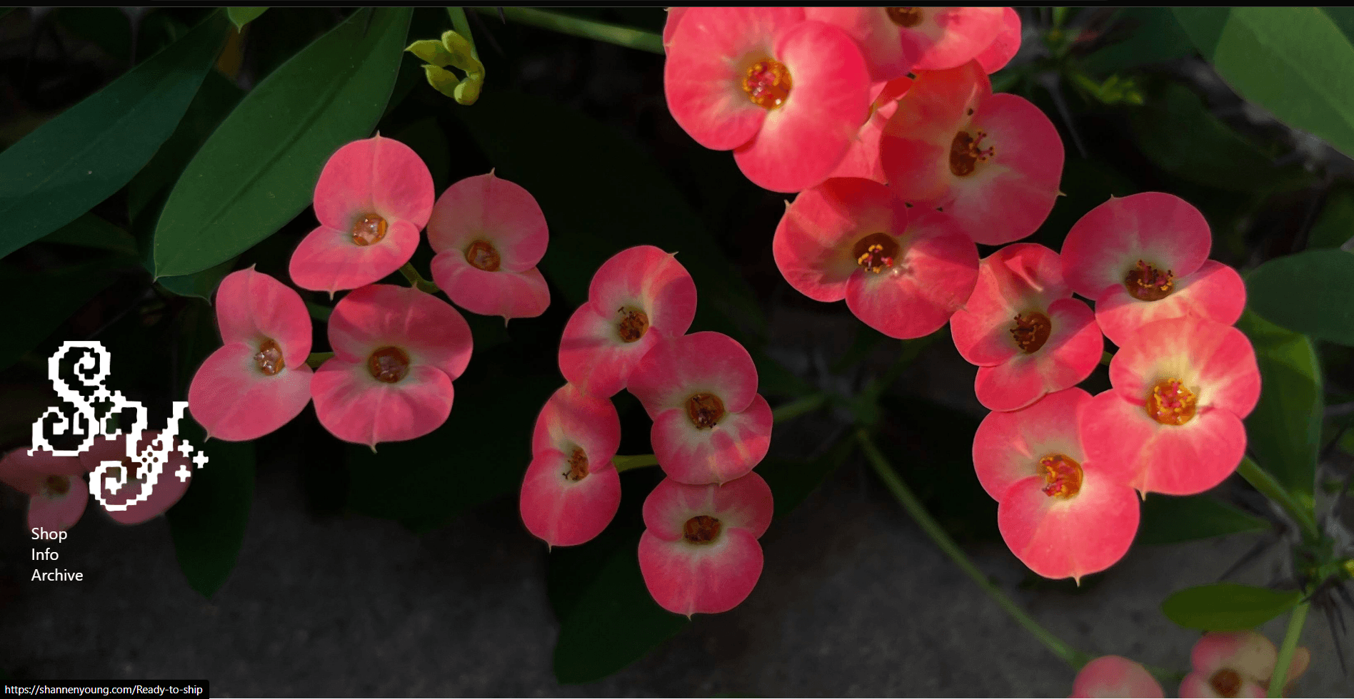
- Anchored the project around a strong mark and treated it as navigation, not decoration.
- Used a book-like interaction to slow the browsing rhythm and make the site feel held.
- Kept the interface sparse so the imagery and identity did the heavy lifting.