Home → Playing Field

Case Study / 06

Playing Field

A mobile concept for sharing taste through moodboards and references instead of scattered screenshots and chat threads.

React Native concept · Figma

Playing Field concept artwork.
The concept is about shared taste first, interface second.

Creative direction gets lost quickly when images, links, and half-explained references are spread across messages. The idea behind Playing Field was to make visual communication feel social, lightweight, and immediate.

Rather than treat references as files to manage, the concept treats them as a shared field of taste that can be browsed, saved, and read together.

Designed the product concept, interface direction, information hierarchy, and the core interaction model shown in the mobile screens.

Key decisions

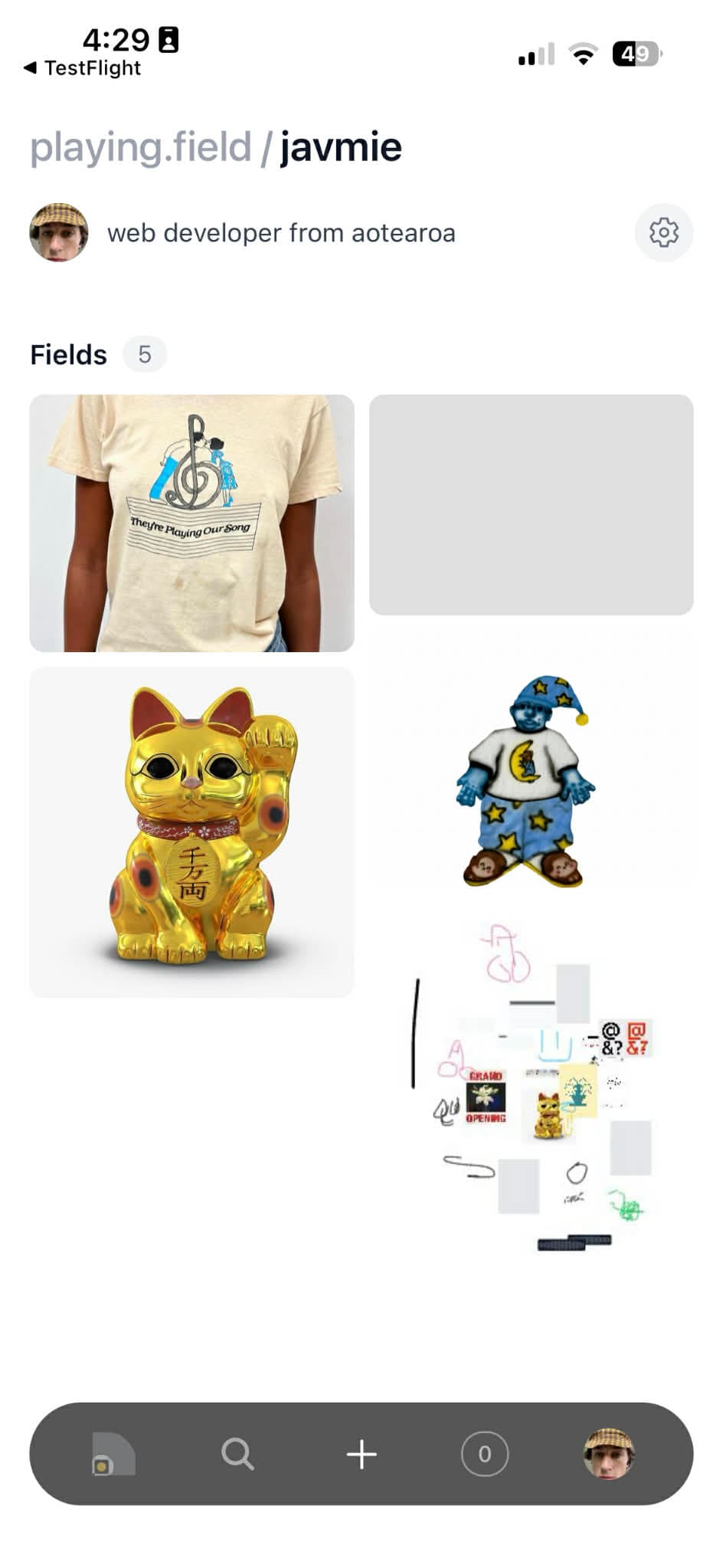
  • Kept the home view image-first so the product idea reads before the UI does.
  • Used familiar mobile patterns only where they help the moodboard concept move faster.
  • Let saved references feel collectible and expressive instead of filing-system neutral.
Key challenges

  • Holding a quiet interface while the underlying media stays visually noisy and varied.
  • Making taste communication feel collaborative without turning the app into chat.
  • Keeping the concept broad enough for creative use while still feeling like one product.

Key iterations

  • Tightened the recents view so references stay the centre of gravity.
  • Simplified bottom navigation and profile treatment to reduce UI competition.
  • Shifted the concept away from utility language and toward visible mood, collection, and recall.
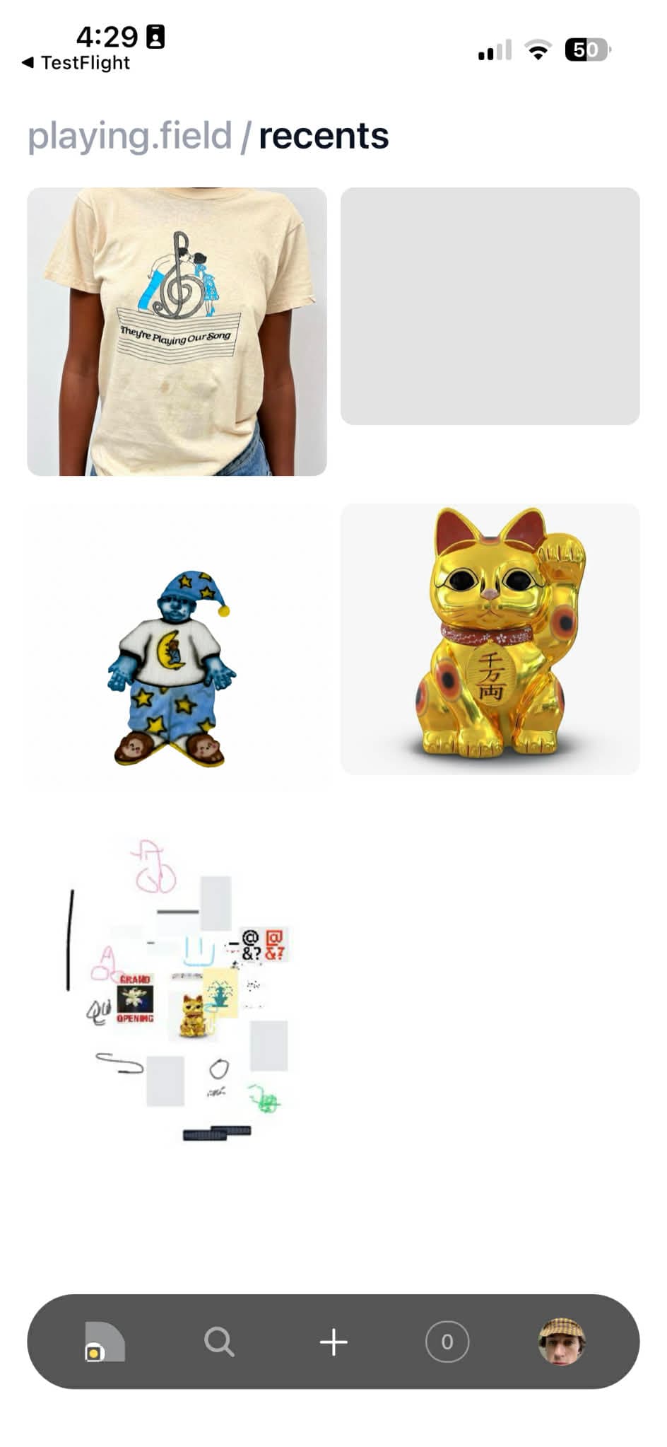
Playing Field recents screen.
Recents turns the app into a living moodboard instead of a static archive.
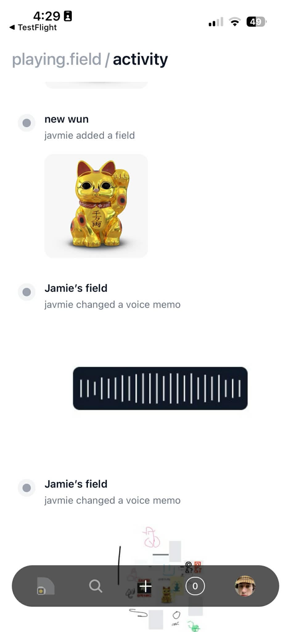
Playing Field mobile screen.
The screenshots prove the product direction without overbuilding the idea.
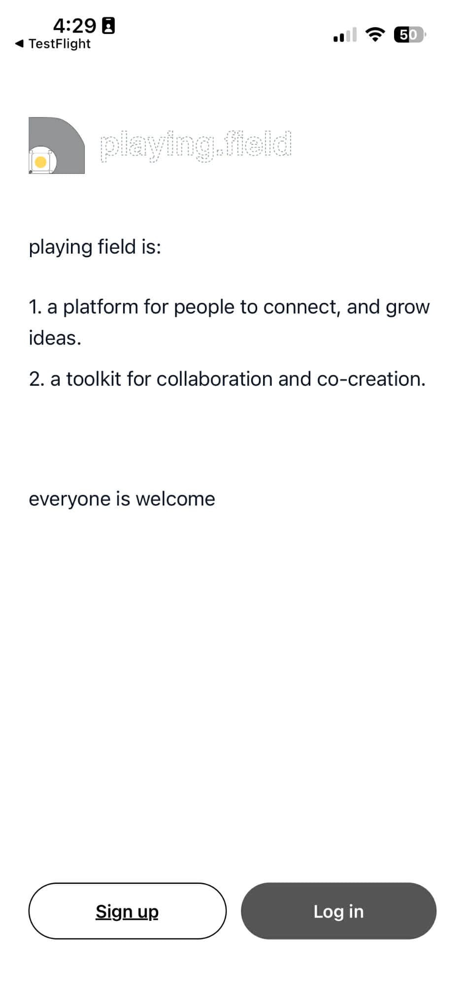
Playing Field mobile screen.
Saved references stay visual and fast to scan.
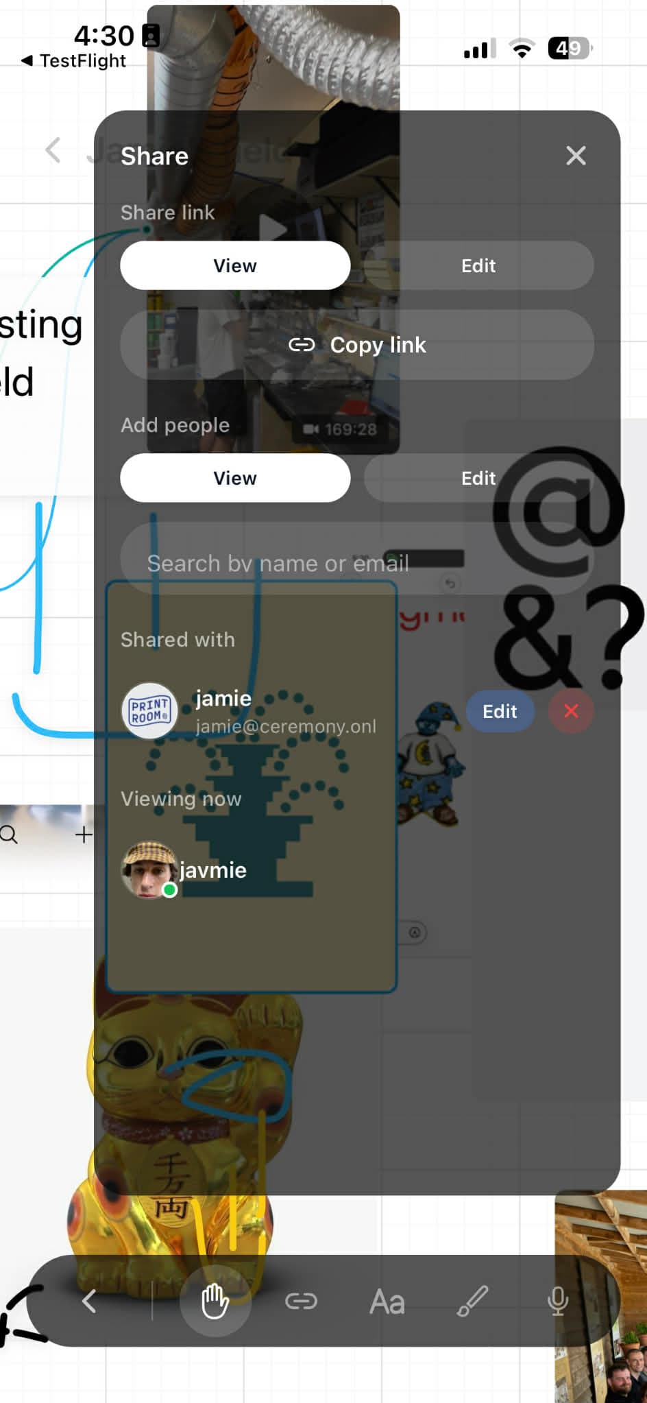
Playing Field mobile screen.
The concept reads as social direction-sharing rather than content management.
Playing Field mobile screen.
The App Store-style screens give the idea a concrete public face.

What exists now

  • A mobile product concept with a clear visual feed, saved references, and navigation model.
  • A set of screenshots that read like a real product pitch instead of loose interface fragments.

What works

  • The product idea is legible from the screens alone.
  • The interface keeps images as the main event rather than wrapping them in extra explanation.
  • The concept feels usable without needing a large feature set to prove itself.

What I'd do next

  • Prototype shared boards, collaborative comments, and the specific handoff moments between collaborators.

The point of Playing Field is simple: creative direction should feel shareable while it is still alive, not only after it has been flattened into a brief.